Industry
Architecture
Client
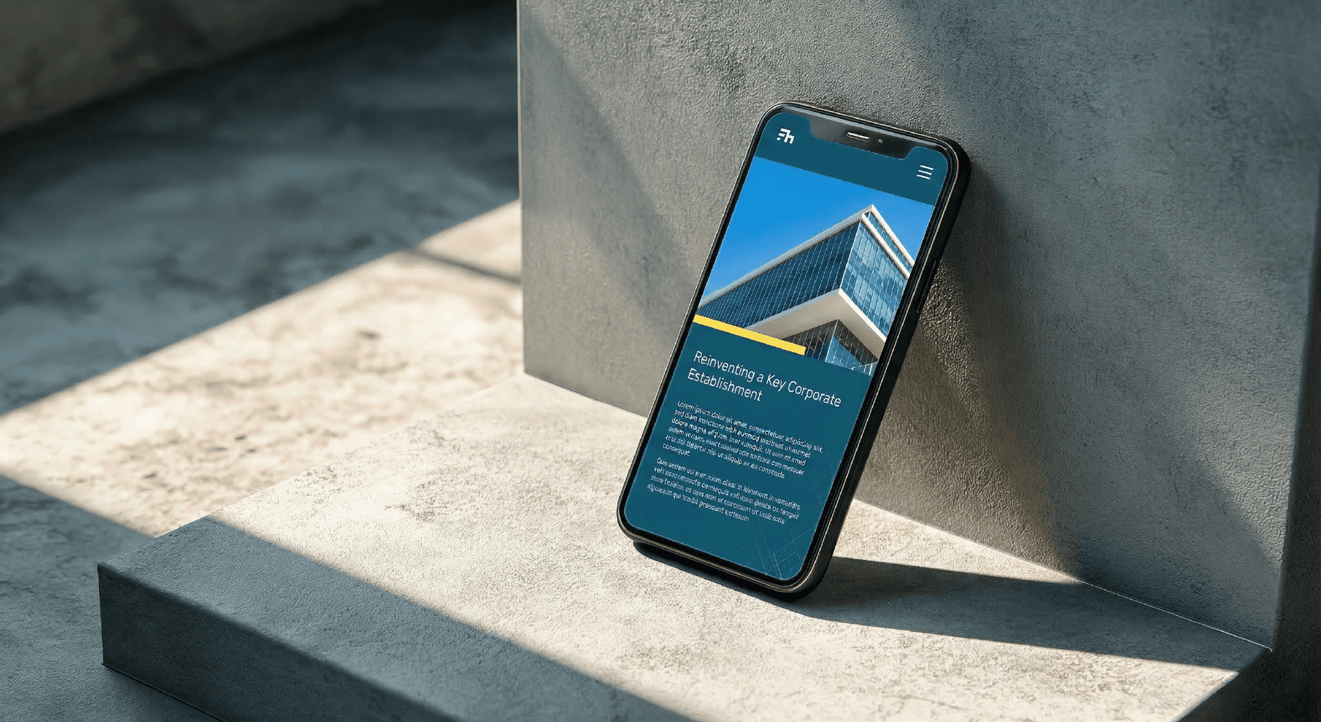
Filhauer
Building Developments with Precision and Refinement

The Story
Filhauer is a conceptual architectural firm grounded in the precision and discipline that define the built environment. The work centers on designing and delivering high-end developments across private, government, commercial sectors, and spaces that require both technical rigor and a strong visual point of view. This project focused on shaping a visual identity that could structurally and intentionally hold balance, and be capable of supporting the firm’s presence across both physical and digital spaces.


Our Approach
The process began with research and taking time to understand not just the architectural landscape, but how Filhauer might fit within it. From there, the identity started to take shape through exploration of form and structure. A monogram emerged as the most fitting direction. By working with the “F” and “h” in Filhauer, the mark evolved into something both symbolic and functional, abstracted letterforms that subtly echo the geometry of buildings and structural frameworks. Typography played a supporting role in reinforcing that sense of construction and clarity. Rigid Square was chosen for its architectural presence, paired with Inter to maintain readability and versatility across applications. The color palette draws from a place of trust and precision, while also referencing materials and tones commonly found within construction environments. To bring everything together, a restrained blueprint-inspired visual language was introduced and used carefully to add depth without overwhelming the system.


The Challenge
The challenge was to create a brand identity system that felt as considered as the work itself. It needed to be immediately recognizable, yet flexible enough to function across a wide range of applications, from on-site materials to digital platforms. At its core, the system had to resonate with multiple audiences including clients, contractors, and collaborators, while maintaining a clear sense of authority and cohesion within a highly detail-oriented industry.